Nordstrom Global Navigation
Nordstrom, 2012 – 2014
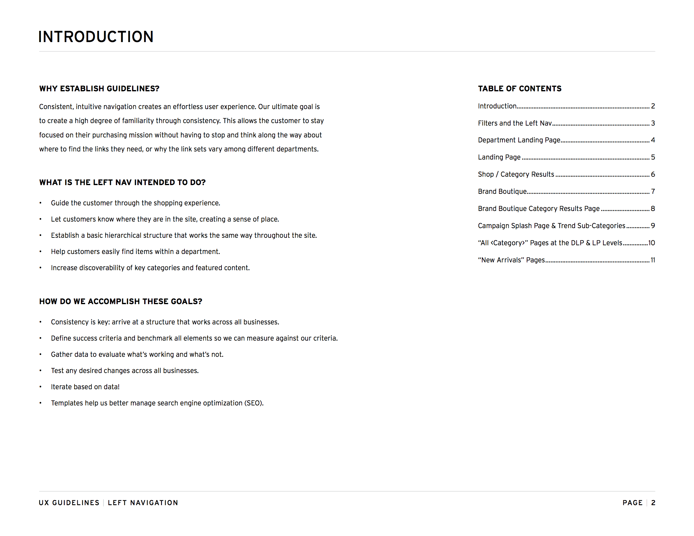
Navigation on a site as big as Nordstrom's can be complex, for the customer and for the people who are trying to manage it.
In 2012, the process of updating the customer-facing navigation was almost entirely manual, and was conducted by a large number of people across several teams.
No documentation existed to help all those people understand the navigation's original design intent, so I created a set of guidelines to help the army of folks publishing pages do so consistently.
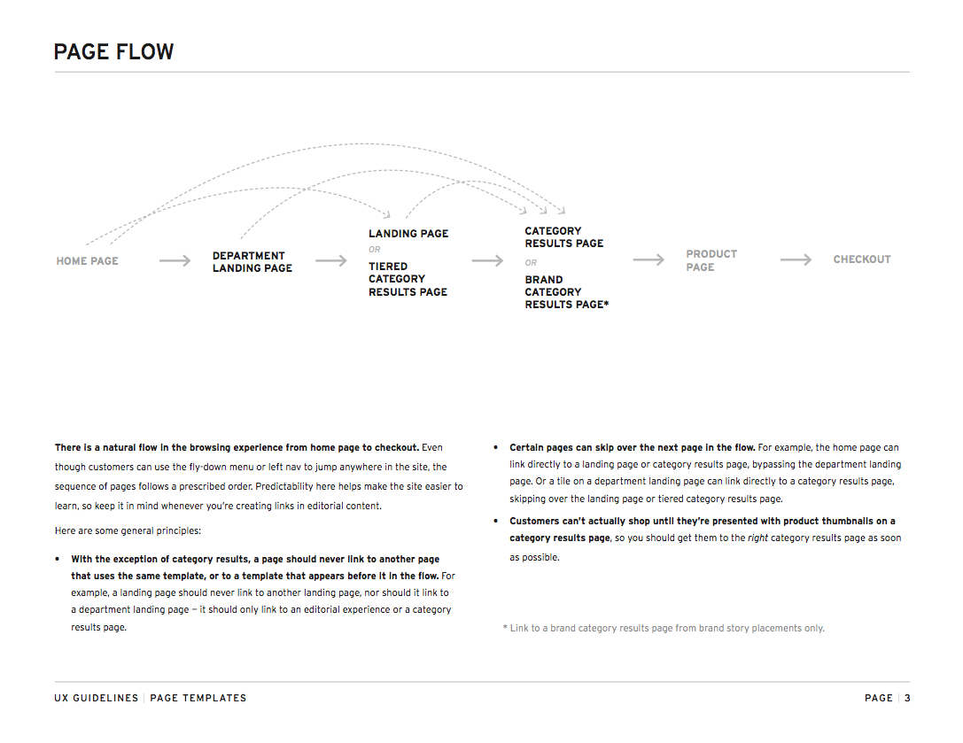
Monthly check-ins with the operations team produced a long series of updates to this document, as business needs evolved.
While I was at it, I wrote guidelines for our local navigation, which is also managed manually.
In 2013, I was tasked with finding avenues for optimization in our global navigation.
Specifically, optimizing the functionality and taxonomy of the top level links and their "fly-downs", the giant menus that appear on hover or tap.
We didn't actually have a lot of concrete information around how customers think about and used our navigation, so a fair amount of research was required before we could tackle a redesign.
Competitive Analysis
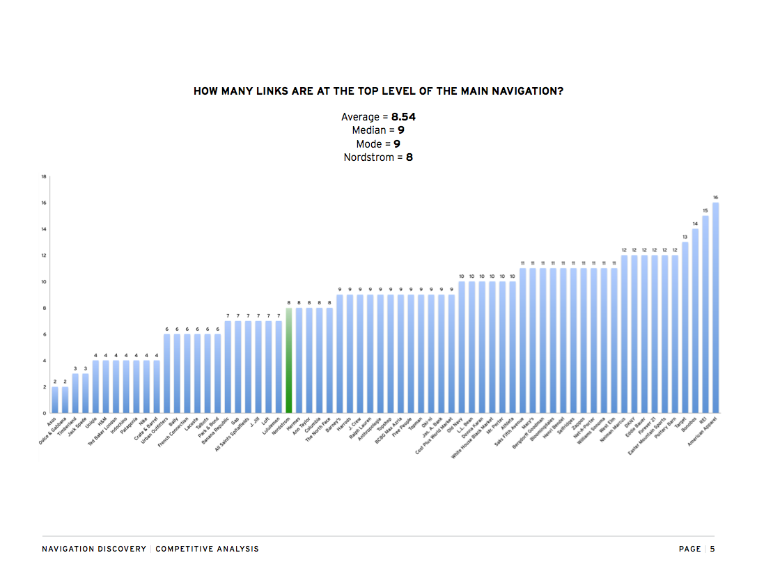
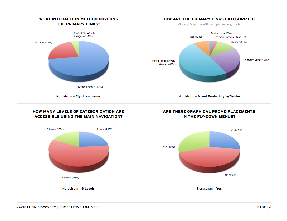
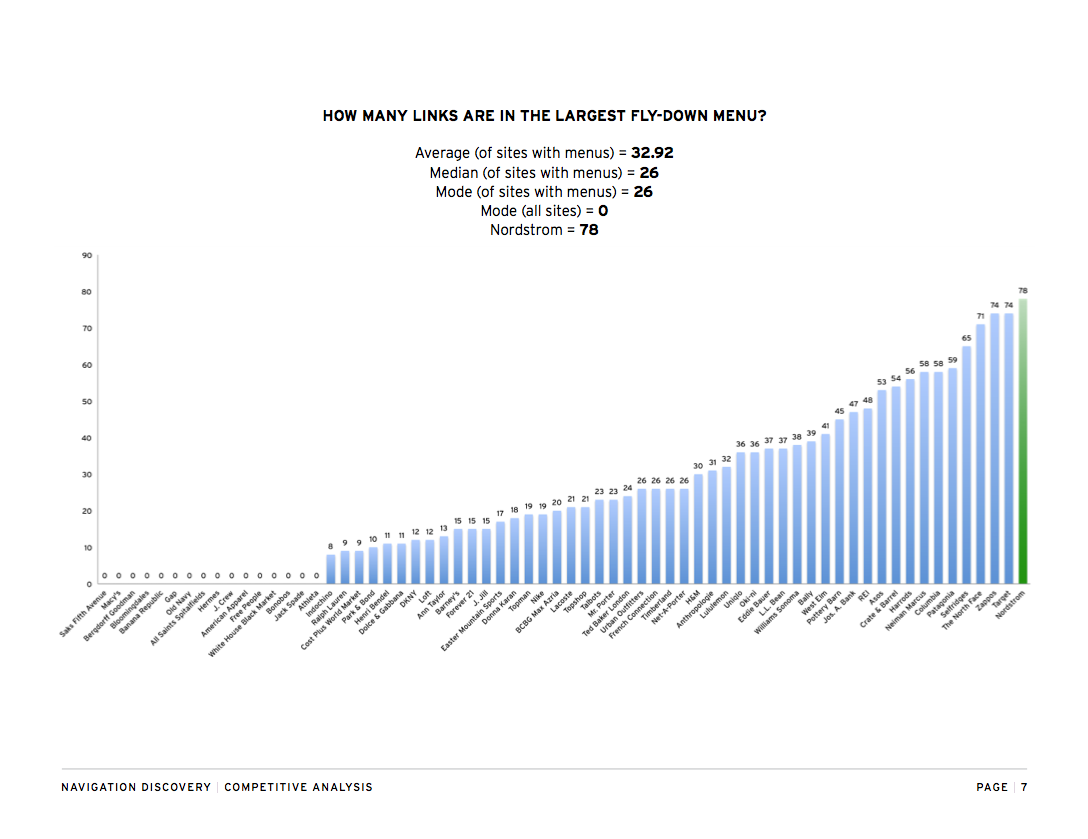
I started with a competitive analysis of 65 retailers — a way bigger sample than I would normally use. But customers form mental models based on all the sites they visit, and this is true for navigation perhaps more than anywhere else.
Quantitative Research
Next we conducted a series of live site tests to help us understand what levers we could pull to influence customer behavior. The tests explored the following questions:
- How important are the mega fly-down menus? Just how mega should they be?
- How deep into the catalog do customers want to go at a time?
- Do customers primarily start shopping by gender or by product category?
The results confirmed some hypotheses and disproved others, but we were starting to get a clearer picture.
Card Sorts
Finally, we conducted a couple of card sorts and a tree test. These studies helped us understand our customers' various conceptual models of how the catalog is structured and named.

We conducted one online card sort and one in the lab.
Turns out this is what the results of a large online card sort look like.

Card sort findings were validated using tree tests.
Redesign
Our research suggested that customers had a mixed mental model of our catalog, thinking in terms of gender in some scenarios, and product type in others. And some customers only thought one way or the other.
Customers also liked to have a lot of choices in the fly-down menus — but not too many or it became overwhelming.
To address these and other key findings, my new design included the following features:
- New categories were added to the top level, offering more possible paths into the catalog.
- Customers could now browse by product type first, then gender — or the other way around. This accommodated all the various conceptual models we uncovered in the card sorts.
- The number of links in all the fly-down menus were reduced by about 40%, making them much easier to scan.
- The hover delay on the fly-down menus was reduced from 250ms to 50ms, making them feel faster and more responsive.
- Graphical promos were removed from the menus to make them actually faster and more responsive.
- Space was added between the links in the fly-downs to meet our newly defined touch target guidelines.
The old design, showing the fly-down menu for the Women's department. There were over 70 links in that menu, more than any one of the 65 retailers surveyed in my competitive analysis, and more than double the average. Qualitative feedback from customers indicated that the large number of links was hard to scan.
The new design. Note the additional top-level links and the dramatically lighter fly-down menu.